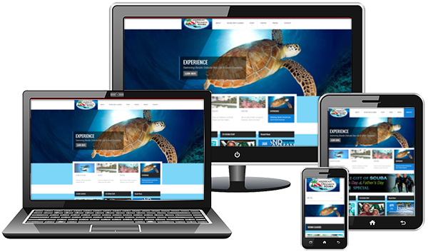
We are firmly in the era of responsive web design.
Its requirement for user approval and website success has achieved serious momentum. If you haven’t taken the leap, it’s now important to consider how responsive design can benefit your own website.
Building on the WordPress’ powerful foundation, many beautiful responsive themes are adapt to various screen resolutions and look incredible on both tablets and mobile devices, allowing anyone to get his or her website functioning on all devices mobile or desktop.
Responsive Web Design (RWD) is a lay-out and coding of a website that provides optimal viewing experience for every user and their various viewing devices as they visit your website — offering ease of reading and navigation with a minimum of resizing, panning, and scrolling — across a wide range of devices from desktop computer monitors and TV screens to tablets and mobile phones.
Now its Google preferred.
More web surfing is done on smaller mobile phones now than ever, at the same time, we have larger and larger desktop and TV monitors displaying internet media, including websites. There is a balance and need for design that accomplishes a functional navigation, ease of use and access to every website while it displays its branding beautiful and simply in the best quality possible.

WHY RESPONSIVE ?